 All projects
User Experience
Visual
All projects
User Experience
Visual
Countdown - Single Sign On
Background and context
Countdown had a large scaled project going where the goal was to merge both the brand website and the shopping website into one.
There were various customer problems in this space:
1.
Validating the existing programThis is a program that exists in Woolworths in Australia, and it was something that we were looking to replicate in the New Zealand market. Keeping this in mind, there was still a need to validate if the proposition, decisions, and assumptions were still relevant in the New Zealand market. We also had to think about the brand implications of Woolworths, Onecard, and Everyday Rewards.
2.
TimelinesThis project was set on a tight timeline, with many moving parts as it involved many parts of the business and different teams. There were also different launch dates and scenarios that we had to cater for: pre-launch, launch, and post-launch.
3.
Partner collaborationThis would be a brand new foray into partnerships for Woolworths. This meant we had to create new ways of working for partners, including processes such as design alignment, timeline management, design handover, etc.
Going through the Double Diamond
The team were committed to doing this project for the right reasons and in the right way. We decided to use the Double Diamond framework as a basis for our project:
1.
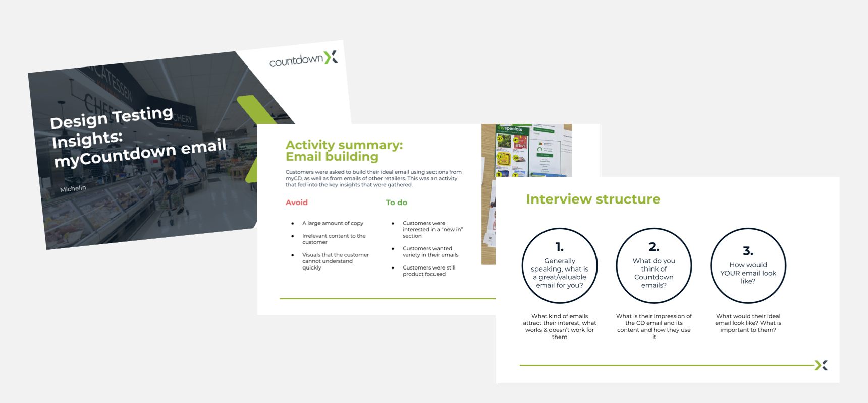
DiscoverWe wanted to find out how customers feel about emails in general, and what they thought of the current state of the myCountdown email. We also wanted to explore current email statistics (open rate, click rate, etc.) and what the technology replatform would mean. Sessions with other parts of the business to understand their pain points were also held.
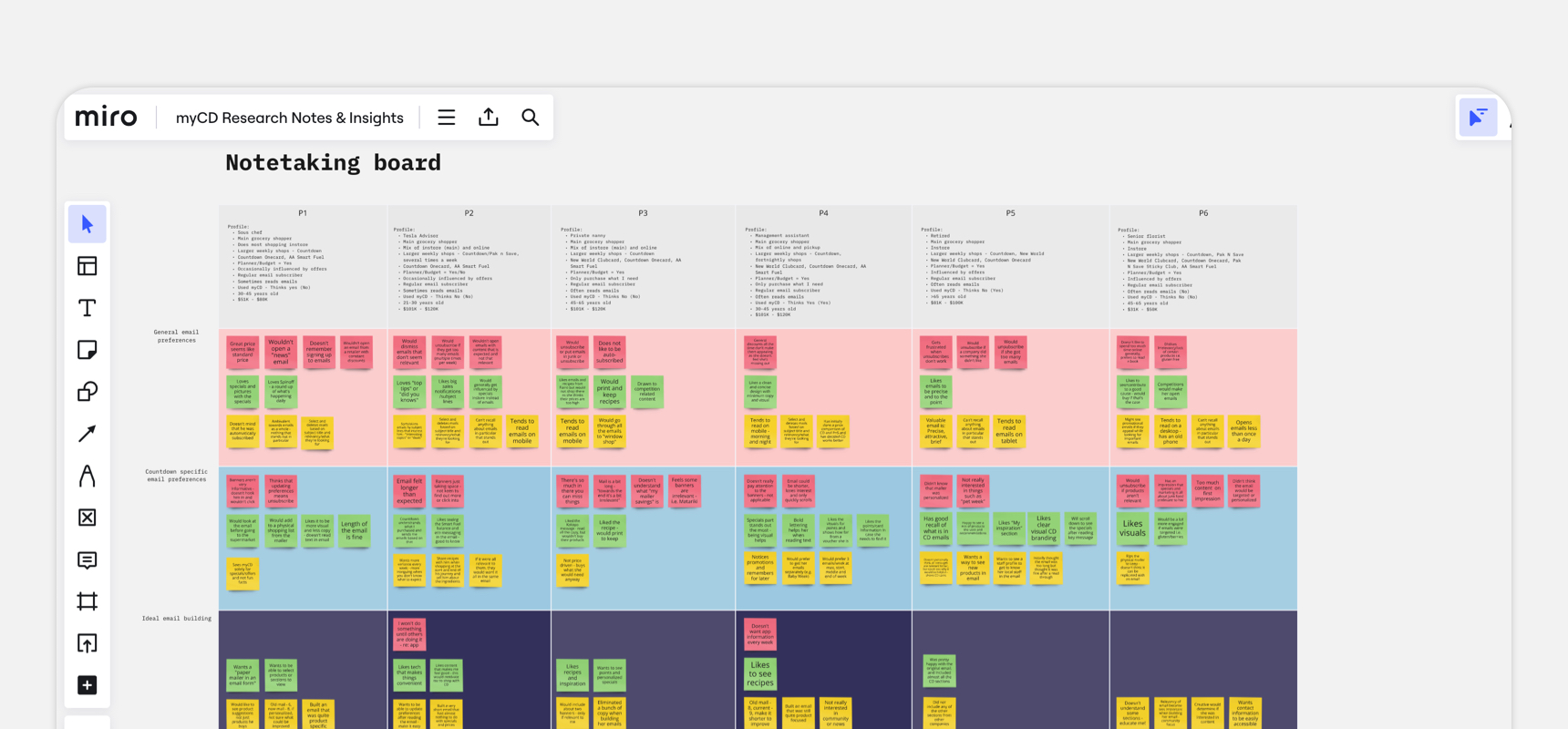
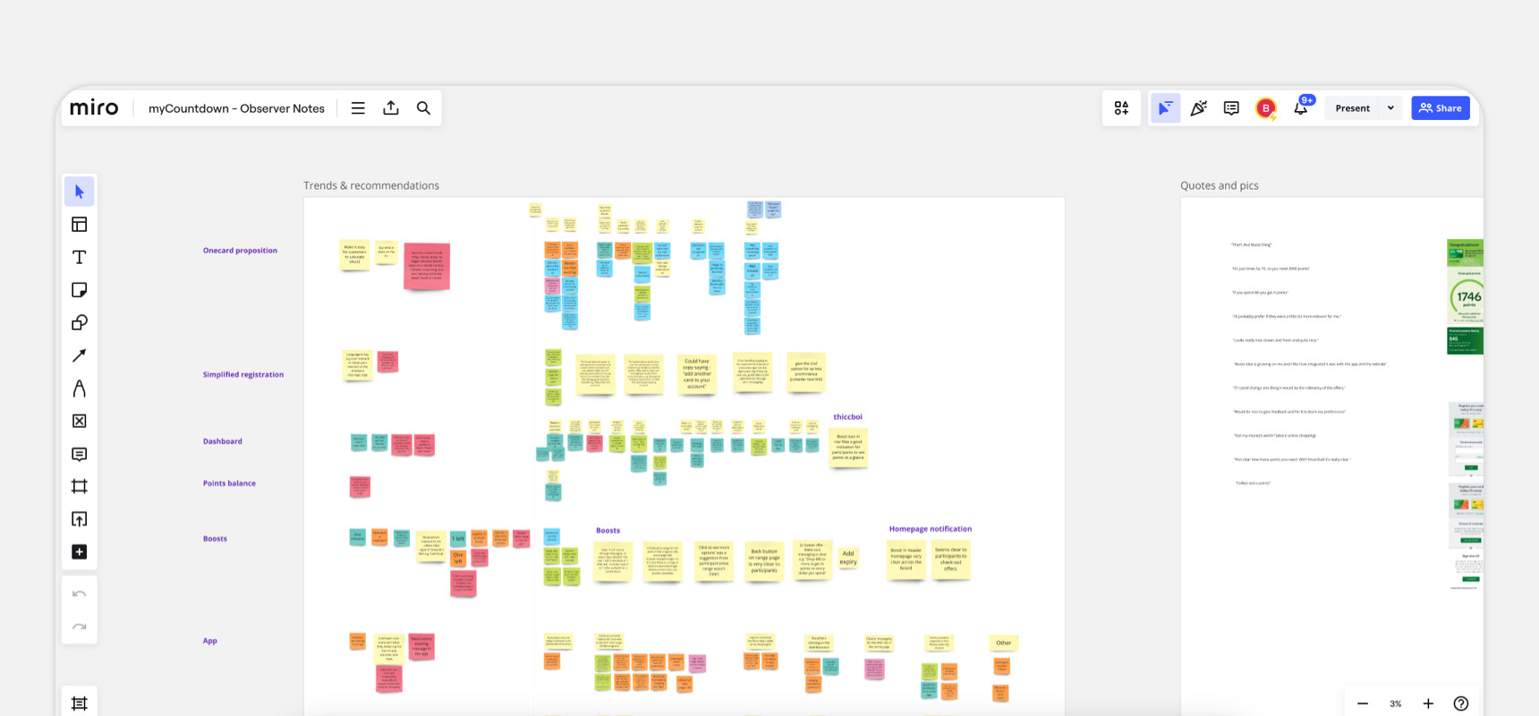
2.
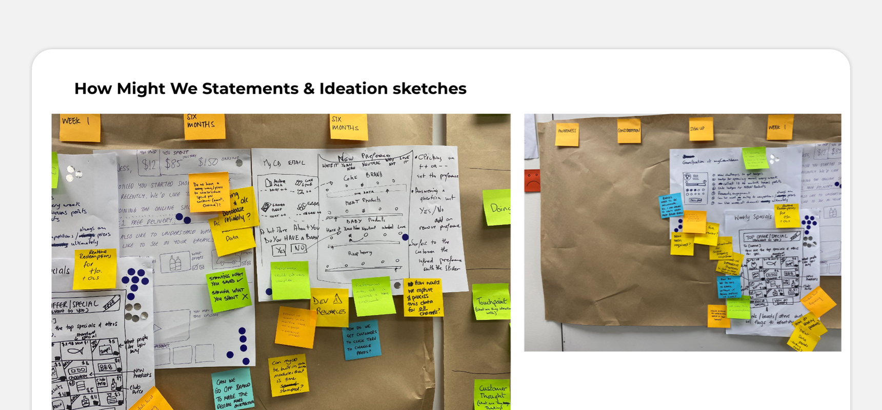
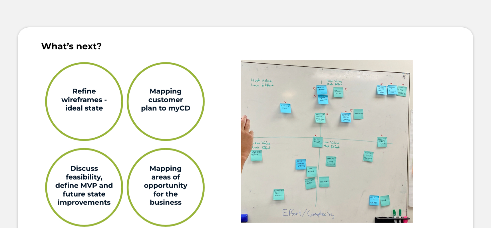
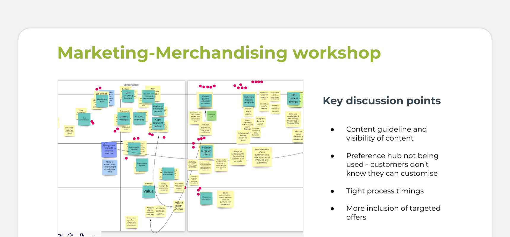
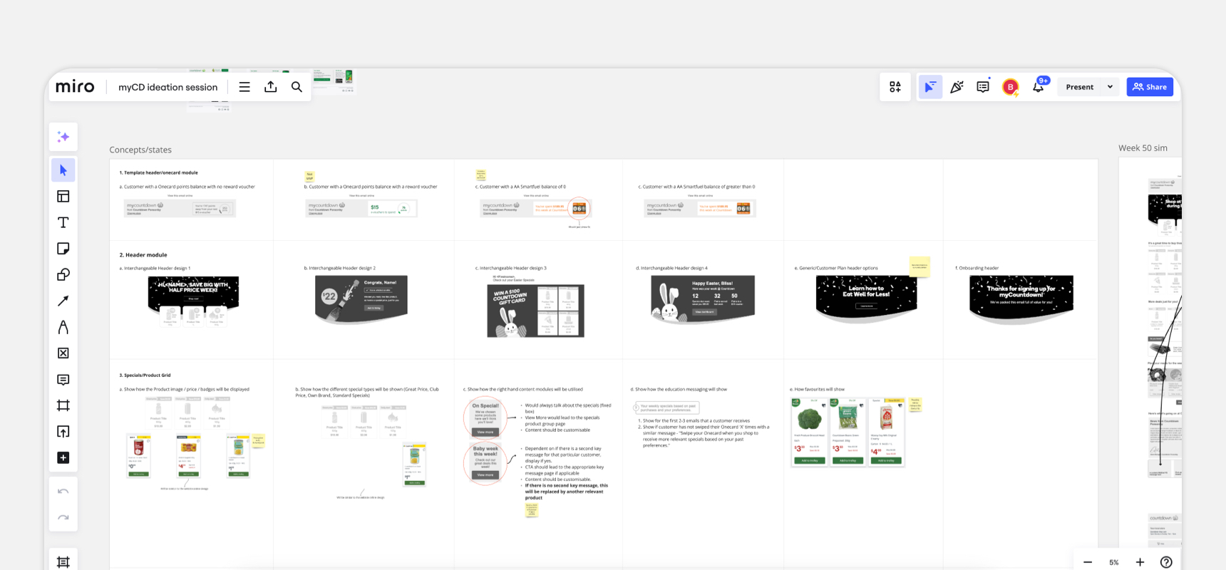
DefineThis started off with quick ideation and customer testing sessions for concepts, and would lead into prioritisation sessions, as well as feasibility and viability sessions. We also brought the relevant stakeholders onboard e.g. marketing, sales, as they would have a vested interest as well.
3.
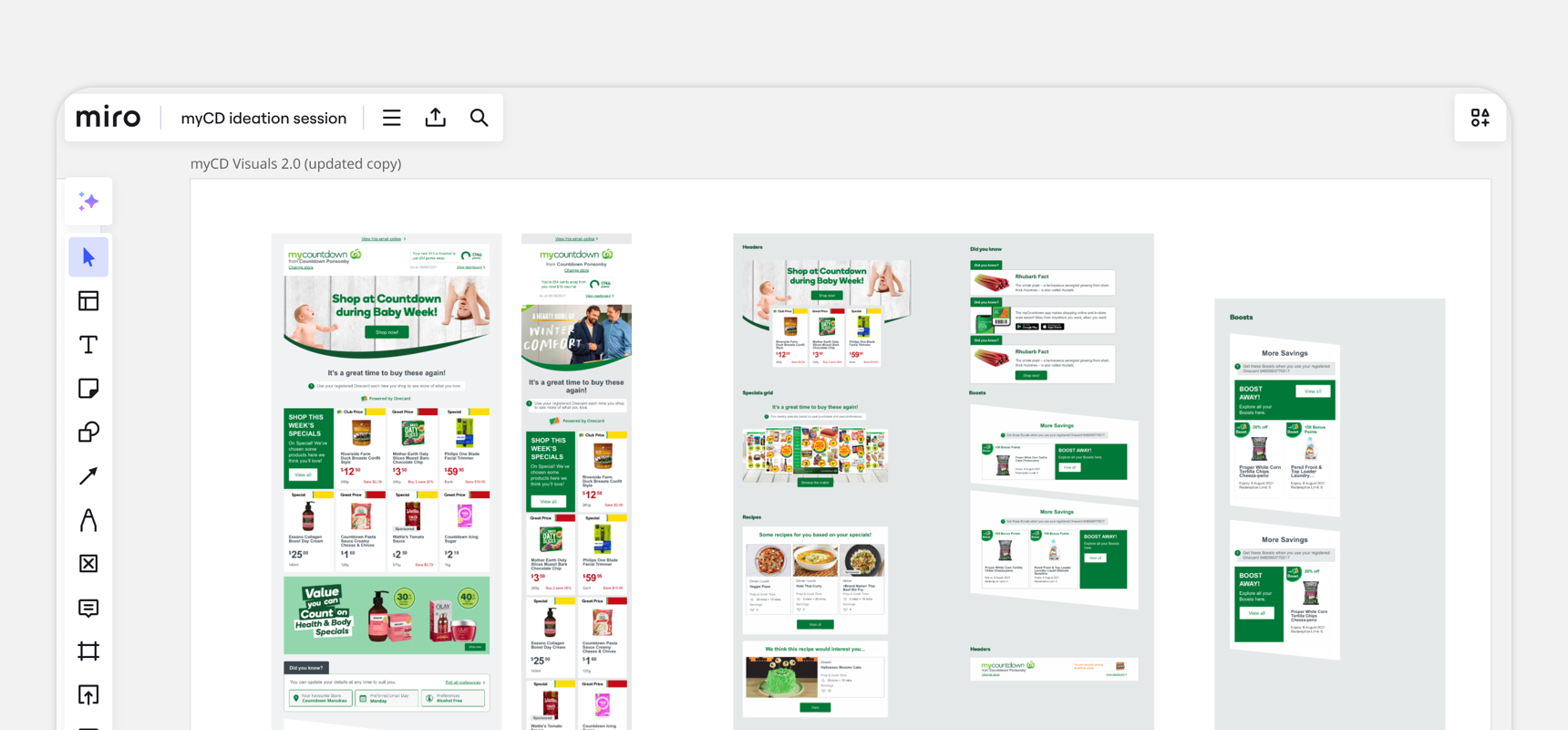
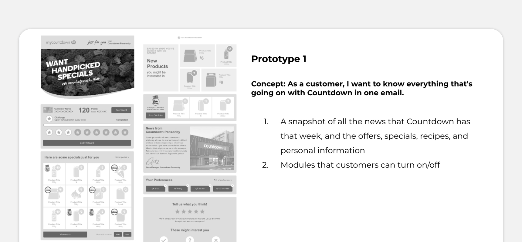
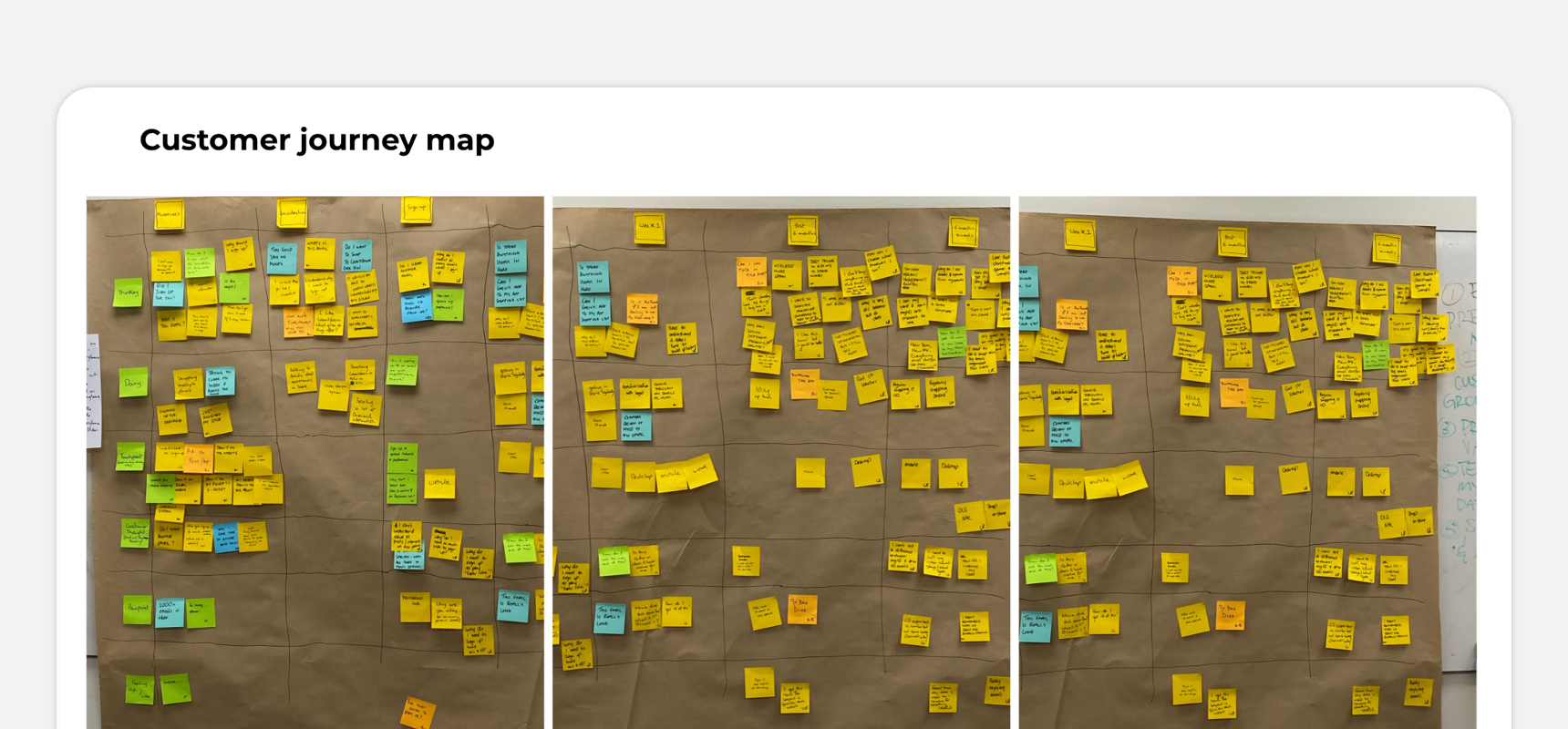
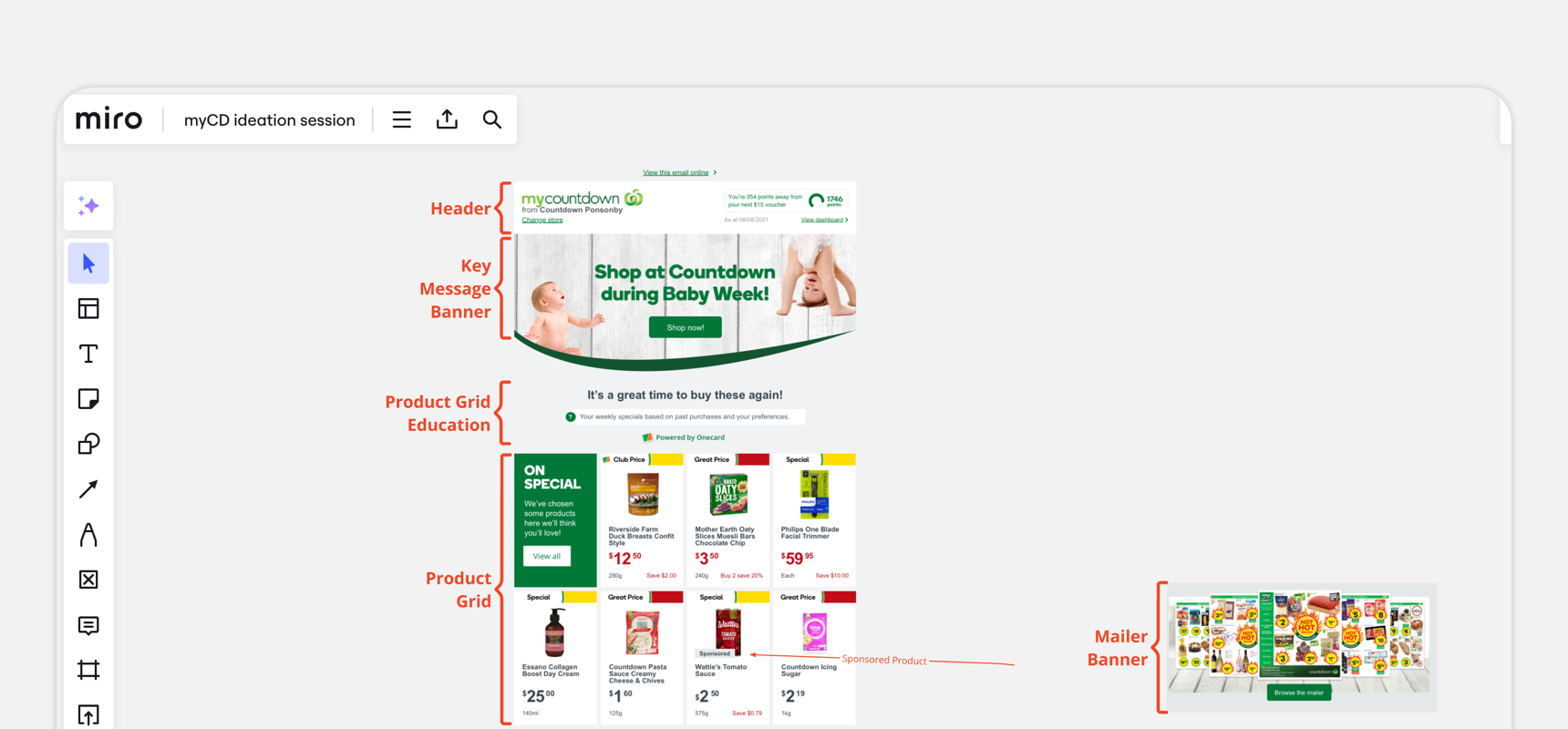
DesignHaving tested the concepts and defined the project, I went into high fidelity designs, defining interactions and the customer journeys and touchpoints the for the email.
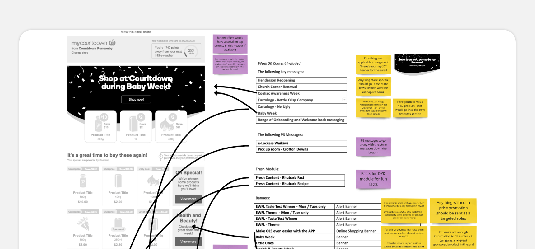
We had to ensure that all the content that were available in the previous email would be accounted for in the new one, unless specifically otherwise decided.
One of the key design problems in the previous email were image-based text, which affected accessibility and scaleability, and this was a main focus for improvement. Another challenge was the technical restrictions of an email platform - there were compatibility concerns, and limitations to what could be achieved on the email platform that had to be considered.

4.
DeliverThe designs were handed over to the developers, with my support in place.
As development went on, there were discoveries in technical feasibility, and we had to review our MVP, and decide what would go on the backlog and what would be a fast follow.