Everyday Rewards New Zealand
What is Everyday Rewards New Zealand?
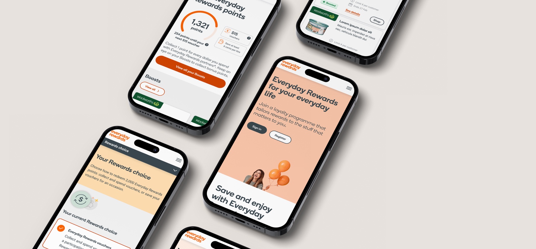
Everyday Rewards New Zealand is a New Zealand loyalty program launched by Woolworths in February 2024. It aims to be the largest loyalty program in New Zealand, giving customers value when they shop with a range of partners in the ecosystem. By working closely with partners to integrate into the program, this enables customers to Boost their purchases, earning more rewards as they shop.
As of September 2024, the EDR website has approximately 1.1m unique users, and 942.5k on the EDR app. Boost engagement rates range approximately from 18-23%, with emails being a large driving factor.
My role
I was the UX lead in the Everyday Rewards and loyalty space. Working together with a team of UX/UI designers, content, senior stakeholders, project managers and owners, our goal was to launch the Everyday Rewards program in New Zealand. I was responsible for:
- Defining and getting the requirements needed for the program
- Working as the conduit between the UX team and other people in the business to have overall oversight of the entire customer journey, define timelines, and manage expectations
- Working in the partner space, crafting clear and compelling narratives to gain buy-in and ensure design alignment
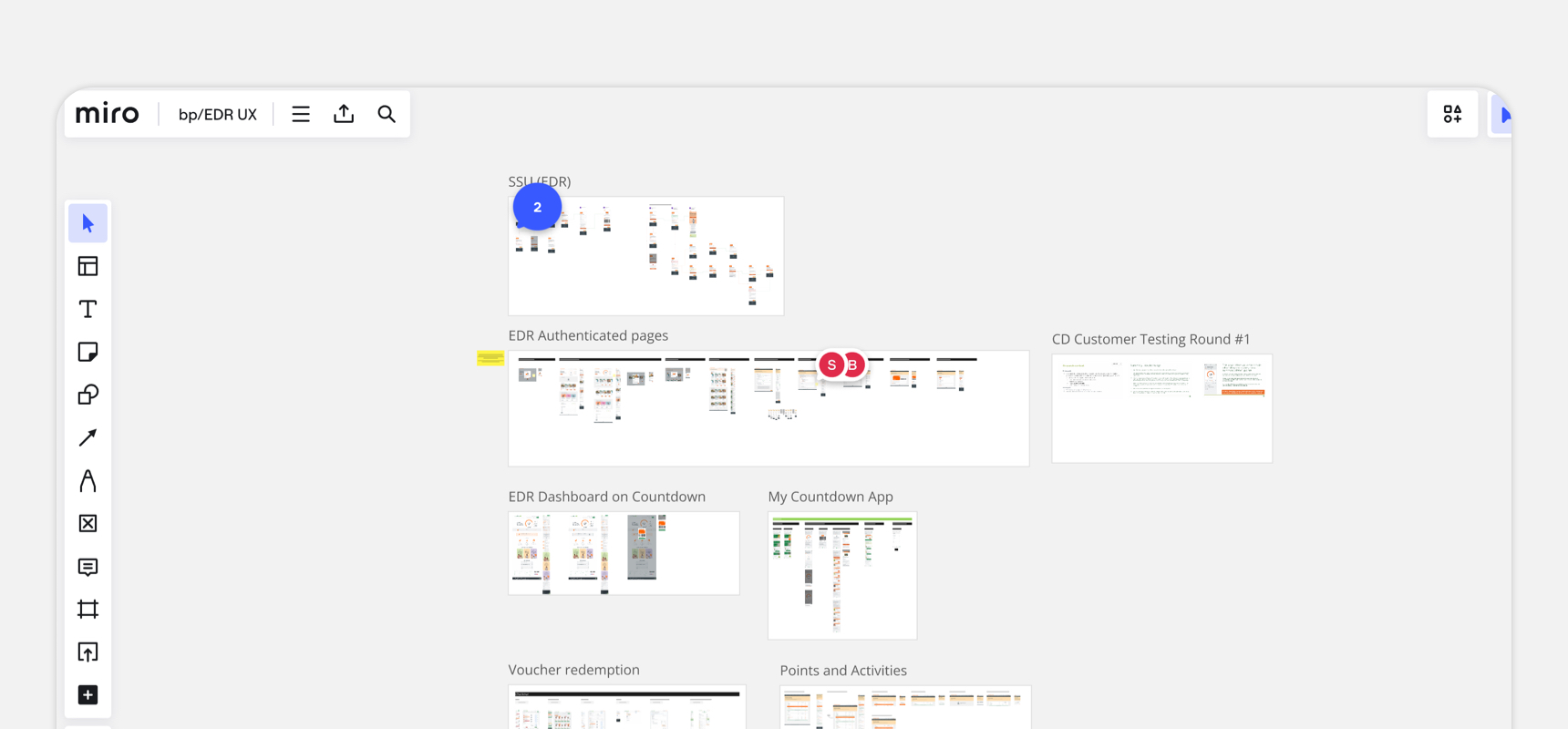
- Creating high level strategic customer journey maps, flows and designs that align with business goals and objectives
- Mentoring junior designers in the onboarding, communications and loyalty experience space
Key project considerations
This was a large scale project with a few unique considerations tied to the proposition:
1.
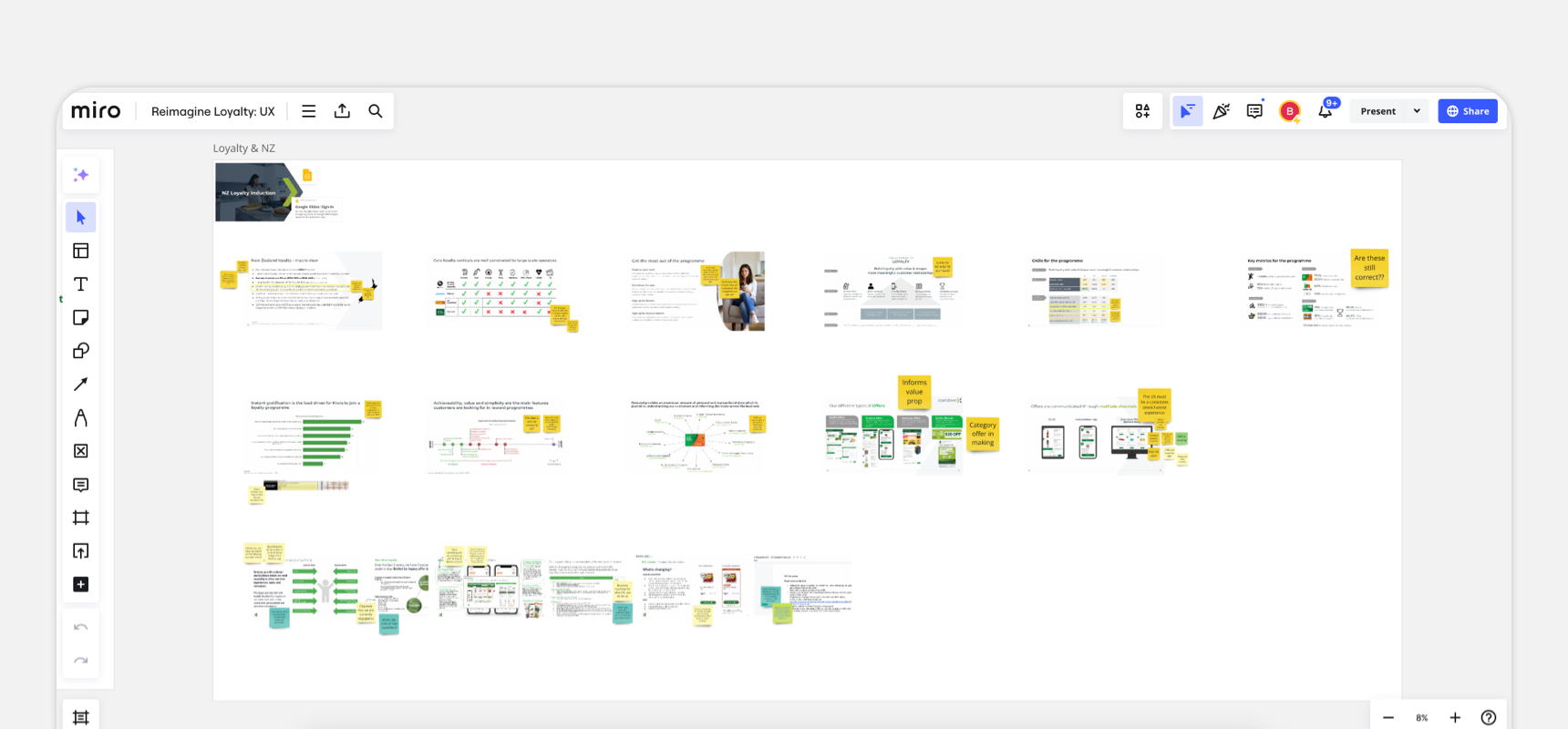
Validating the existing programThis is a program that exists in Woolworths in Australia, and it was something that we were looking to replicate in the New Zealand market. Keeping this in mind, there was still a need to validate if the proposition, decisions, and assumptions were still relevant in the New Zealand market. We also had to think about the brand implications of Woolworths, Onecard, and Everyday Rewards.
2.
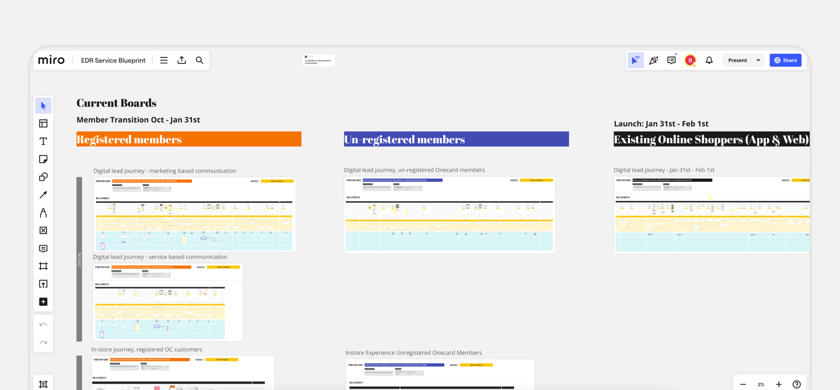
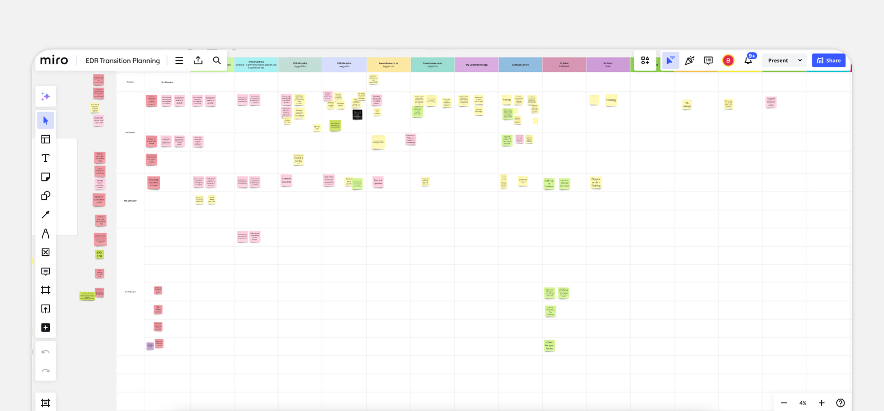
TimelinesThis project was set on a tight timeline, with many moving parts as it involved many parts of the business and different teams. There were also different launch dates and scenarios that we had to cater for: pre-launch, launch, and post-launch.
3.
Partner collaborationThis would be a brand new foray into partnerships for Woolworths. This meant we had to create new ways of working for partners, including processes such as design alignment, timeline management, design handover, etc.
Customer testing
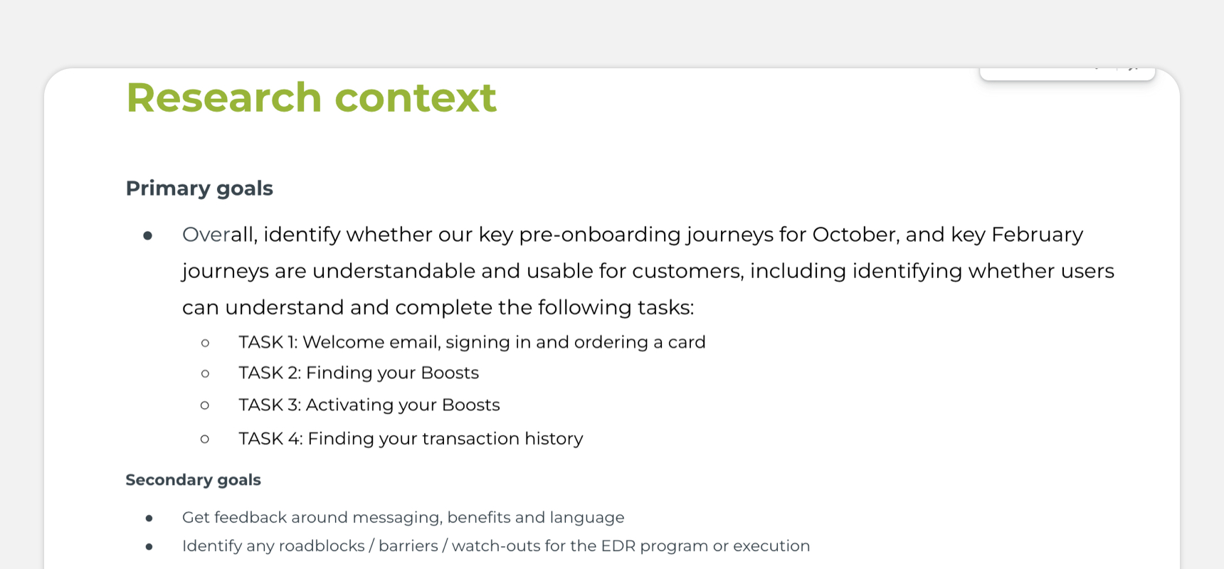
While the timelines were tight, we felt that it was important that we did customer testing, especially customer understanding of the proposition and what we were asking of them from the pre-launch through till the launch period. This decision was also based on the knowledge that the general experience of the program, once launched, had a user experience that had been validated from Everyday Rewards in Australia.
Working with partners
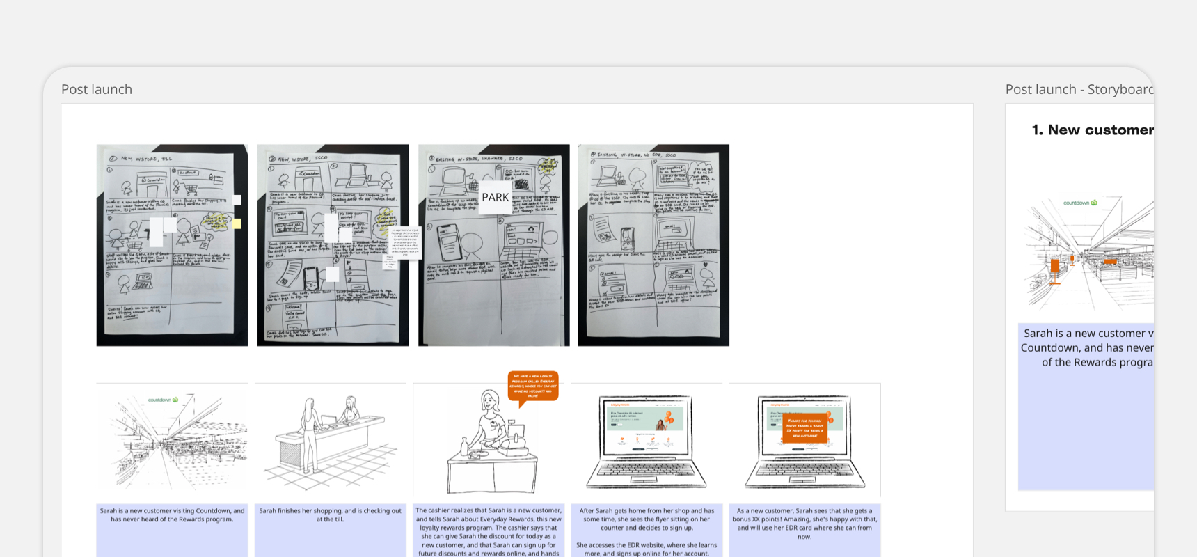
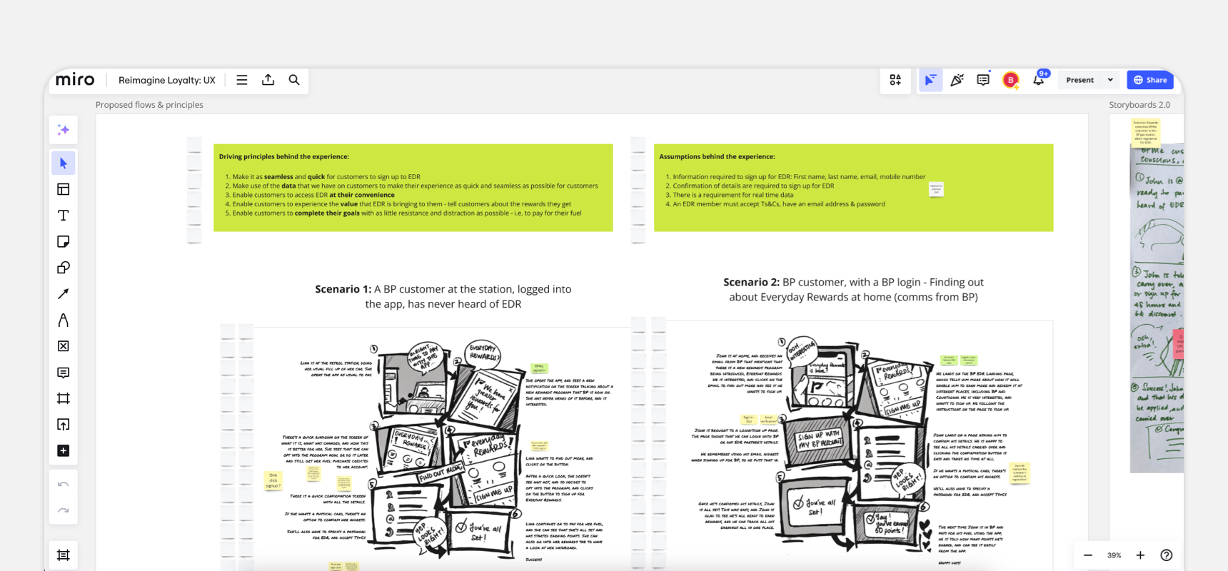
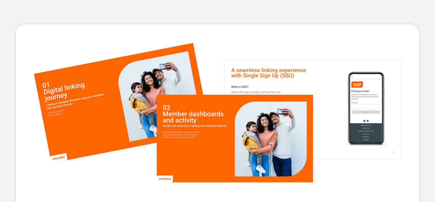
Our initial launching partner in New Zealand was with bp. To achieve design alignment and bring them on board with the customer journey and experience, we created and presented storyboards and flows that showcased how they would be present in our channels, online and offline. We also shared results from our customer testing with partners.
Other considerations
As the program spans across the whole business, there were other things in the end to end experience that also needed to be looked at:
1.
Team experienceEveryday Rewards is a program that runs across both customers, as well as team members. In this process, we also had to look at how the experience would differ in these cases, and this included working with the care and support team, as well as legal.
2.
In-storeWhile a digital experience was our main focus for launch, there were necessary in-store material we had to also build out, as well as partner assets. This included the self service checkout machine (voice prompts, screen prompts), in-store material, as well as the gas pump displays for bp.
3.
Future improvementsDue to the tight timelines, we knew that we had to work towards a MVP. For the future enhancement of the user experience, we created a backlog of UX and UI items that we would have for iterations.
